Friday, September 14, 2012

Great Circles, Black Holes, and Community Events Part 3 of 3


The second community event is the Soldier Hollow Junior Olympics (SoHo), again found in the Heber Valley area. Building upon the previous posts (part 1 and part 2) this one will show an event that has more people coming from greater distance. Take the bar charts for the number of participants and the cities they are from. Instead of 2 major cities (Heber Valley Railroad), SoHo has several cities and states with many participants for each.


The histogram for distance shows a similar pattern, where with the railroad it was a nice log looking distribution, this is a little more even. The second histogram is a zoomed in and the bins expanded for greater detail.


While the map is not as great as the railroad, which is why the distance histogram is so important, it does show a good representation of the northwestern states. Unlike the railroad map, each line does represent more participants than 3.


What makes this tool so great is the ability to visually show the interaction between distance, number of participants, and the draw of an event. The numbers are nothing really new, but the charts are what make this analysis shine. When talking to community representatives whose education range from high school graduate to PhD, pictures are critical.

#Soldier Hallow Analysis
soho<-read.csv(file.choose(), header=TRUE)
summary(soho)
table.city<-sort(table(soho$city), decreasing=TRUE)
table.st<-sort(table(soho$state), decreasing=TRUE)
par(mar=c(5, 11, 4, 2), las=2)
barplot(table.city, main=‘SoHo: Cities’, horiz=TRUE, col=‘red’)
par(mar=c(5, 4, 4, 2), las=2)
barplot(table.st, main=‘SoHo: States’, horiz=TRUE, col=‘red’)
heber<-c(-111.33259, 40.511413)
soho.data<-matrix(data=c(soho$long, soho$lat), nrow=373, ncol=2)
soho.ut<-subset(soho, subset=(state==‘UT’))
soho.data.ut<-matrix(data=c(soho.ut$long, soho.ut$lat), nrow=29, ncol=2)
soho.dist<-(distm(heber, soho.data, fun=distVincentyEllipsoid)*0.000621371192)
soho.dist.ut<-(distm(heber, soho.data.ut, fun=distVincentyEllipsoid)*0.000621371192)
dist.soho<-matrix(soho.dist, nrow=373, ncol=1)
dist.soho.ut<-matrix(soho.dist.ut, nrow=29, ncol=1)
summary(dist.soho)
sd(dist.soho)
p.skew.soho<-(3*(mean(dist.soho)-median(dist.soho)))/sd(dist.soho)
hist(dist.soho, main=‘SoHo: Distance Histogram’, col=‘red’)
hist(dist.soho.ut, main=‘SoHo: Distance Histogram Utah’, breaks=20, col=‘red’)
#mapping it out
#US
map("state", col="#f2f2f2", fill=TRUE, bg="white", lwd=0.25)
title(main=‘SoHo: US Map’)
for(i in 1:dim(soho.data)[1]){
 inter <- gcIntermediate(heber, soho.data[i, 1:2], n=373, addStartEnd=TRUE)
 lines(inter, col="red")
}
 
#Zoomed into West
par(mfrow=c(1,2), mar=c(5,4,4,2))
map("state", col="#f2f2f2", fill=TRUE, bg="white", lwd=0.25, xlim=c(-125, -103), ylim=c(30, 50))
title(main=‘SoHo: Western Region’)
 
for(i in 1:dim(soho.data)[1]){
 inter <- gcIntermediate(heber, soho.data[i, 1:2], n=373, addStartEnd=TRUE)
 lines(inter, col="red")
}
#Utah
map("state", col="#f2f2f2", fill=TRUE, bg="white", lwd=0.25, xlim=c(-112.1, -111), ylim=c(40, 42))
title(main=‘SoHo: Utah’)
for(i in 1:dim(soho.data.ut)[1]){
 inter <- gcIntermediate(heber, soho.data.ut[i, 1:2], n=29, addStartEnd=TRUE)
 lines(inter, col="red")
}
par(mfrow=c(1,1))
Created by Pretty R at inside-R.org

Wednesday, September 12, 2012

Great Circles, Black Holes, and Community Events Part 2 of 3


This post will examine the Heber Valley Railroad, a small town tourist attraction using event gravitational pull. Using the information from part 1 the two factors associated with the events gravity, the number of participants, and the distance they traveled. The number of participants can be shown using bar charts, histograms, and summary tables. The distance traveled can be displayed using bar charts, histograms, summary charts, and most important great circle maps. Below are some of the charts I created when doing the analysis.

The first two are bar charts show where the majority of train riders are coming from. From the graphs Salt Lake City Utah is number one, followed by Ogden, then it goes down hill from there very quickly. The purpose of these first graphs is to show how many people are coming to the event and where.


Where the first set of graphs show the cities, the histograms show where people are coming from in terms of distance. The first histogram shows all the data, the next two are zoomed in to show the majority of people travel less than 100 miles (as the crow flies) to get to the train. While the majority of people who ride the train do so within 100 miles, there are many who travel many miles. But it should be noted, there are only 1-3 customers per line. The map looks really good, but the majority of those traveling long distances, are much fewer.


While the map shows a number of people coming from various locations, there are only 1-3 people per line, nothing to really spend any marketing funds to. The map does show how far people do come.


The next two maps show that within Utah the majority of people riding the train come from Salt Lake, Ogden, and the Wasatch Front area.


require(geosphere)
require(maps) 
 
#HVRR Analysis
#Step 1: basic Stats. Summaries, Histograms, bar charts
#reading the file in
 
hvrr<-read.table(file.choose(), header=TRUE)
 
#summary stats
summary(hvrr)
 
#histograms
par(mfrow=c(1,2))
label.1<-c(‘Utah (424 88%)’, ‘Other(58 12%)’)
state<-c(424, 58)
barplot(state, names.arg=label.1, main=‘HVRR: States’, col=‘blue’)
label.2<-c(‘Salt Lake’, ‘Ogden’, ‘Other’)
cities<-c(173, 102, 149)
barplot(cities, names.arg=label.2, main=‘HVRR: Cities Within Utah’, col=‘blue’)
par(las=2, mar=c(5,12,4,2), mfrow=c(1,1))
city.1<-sort(table(hvrr$city))
city.1<-tail(city.1, n=20)
barplot(city.1, col=‘blue’, hor=TRUE, main=‘HVRR: Utah Cities Top 20’)
par(las=0, mar=c(5,4,4,2))
 
#distance analysis
heber<-c(-111.33259, 40.511413)
data<-matrix(data=c(hvrr$long, hvrr$lat), nrow=482, ncol=2)
ut<-subset(hvrr, subset=(st==‘UT’))
data.ut<-matrix(data=c(ut$long, ut$lat), nrow=424, ncol=2)
dist<-(distm(heber, data, fun=distVincentyEllipsoid)*0.000621371192)
dist.rr<-matrix(dist, nrow=482, ncol=1)
hvrr<-cbind(hvrr, dist.rr)
 
#histograms of various shapes and zooms
summary(dist.rr)
par(mfrow=c(1, 3))
hist(dist.rr, breaks=12, main=‘HVRR Distances: 0-3,000 miles’, xlab=‘Distance in Miles’, col=‘blue’)
hist(dist.rr, breaks=24, main=‘HVRR Distances: 0-500 miles’, xlab=‘Distance in Miles’, xlim=c(0, 500), col=‘blue’)
hist(dist.rr, breaks=50, main=‘HVRR Distances: 0-200 miles’, xlab=‘Distance in Miles’, xlim=c(0, 200), col=‘blue’)
par(mfrow=c(1,1))
 
#mapping it out
 
#US
map("world", col="#f2f2f2", fill=TRUE, bg="white", lwd=0.25, xlim=c(-158, -65), ylim=c(15, 50))
title(main=‘HVRR: US Map’)
for(i in 1:dim(data)[1]){
 inter <- gcIntermediate(heber, data[i, 1:2], n=482, addStartEnd=TRUE)
 lines(inter, col="blue")
}
 
#Zoomed into Utah
par(mfrow=c(1,1), mar=c(5,4,4,2))
map("state", col="#f2f2f2", fill=TRUE, bg="white", lwd=0.25, xlim=c(-115, -108), ylim=c(37, 42))
title(main=‘HVRR: Utah’)
for(i in 1:dim(data.ut)[1]){
 inter <- gcIntermediate(heber, data.ut[i, 1:2], n=424, addStartEnd=TRUE)
 lines(inter, col="blue")
}
 
#Wasatch Front
map("state", col="#f2f2f2", fill=TRUE, bg="white", lwd=0.25, xlim=c(-112.5, -111), ylim=c(40, 42))
title(main=‘HVRR: Utah- Wasatch Front’)
for(i in 1:dim(data.ut)[1]){
 inter <- gcIntermediate(heber, data.ut[i, 1:2], n=424, addStartEnd=TRUE)
 lines(inter, col="blue")
}
par(mfrow=c(1,1))

Created by Pretty R at inside-R.org

Monday, September 10, 2012

Great Circles, Black Holes, and Community Events Part 1 of 3


About 8 years ago, I was sitting in class listening to a guest lecturer talk about how community events can be described like celestial bodies with their own gravity, where the size and importance of the event would attract more people, from farther away. Much like a black hole, where the bigger the mass of the black hole the higher the gravity.

In physics gravity is a constant, for a community event the gravity can be determined by using the number of participants, and the distance traveled. Where the higher the number of participants and the greater the distance traveled would show an event with higher gravity. For example, a farmers market where only the locals come, versus an international conference of some kind. Assuming both events attract the same number of people, the international conference would have the higher gravity as there would be a larger distance traveled.

Of the two elements the number of participants can be easily found; either by number of seats sold, tickets, counting the number of people present, and so on. The more difficult information is to determine the distance traveled. For this two points are needed, the event (destination) and the point of origin (person's home). The most accurate method would be to get a GPS coordinate for every home, but this would be very difficult mainly because most people do not know what it is, and second they are probably not willing to divulge such information. Another alternative is to request address, again people are becoming much more savvy about personal information, as they should be, and getting a good sample might be problematic. The solution then lies with the zip code, a number with the required latitude and longitude numbers that is broad enough so people do not feel their privacy is being invaded, while still being able to determine a reasonable distance number for each participant.

Using the zip code, and the associated lat and long information the numbers can then be put into R code to draw fantastic maps using the great circle inspired by Oscar Perpiñán Lamigueiro. One question did come out of the data and that is which of the several methods to use when drawing and determining the distance?

The question arises out of the equations assumption on the shape of the earth. Using the Geosphere package there were three equations, the first two Haversine and Vincenty Sphere both assume the earth is round. Which as it turns out it is more elliptical, so there is the Vincenty Ellipsoid. What I wanted to know was is there a big difference between the different formulas? And if so, how big?

require(geosphere)
require(maps)
data(us.cities)
 
#Setting up the data, ‘ny’ is the long. and lat. for New York City, ‘all’ is a matrix of all the 
# cities available in the geosphere package (1005), with the long. and lat. data.
 
ny<-c(-118.41, 34.11)
all<-matrix(data=c(us.cities$long, us.cities$lat), ncol=2)
 
#Summing the distance between NY and all the other cities in the US (1005 of them)
#by so doing the error is compounded with each additional city
 
hav<-sum(distm(ny, all, fun=distHaversine))
hav.time<-proc.time()
v.sphere<-sum(distm(ny, all, fun=distVincentySphere))
v.sphere.time<-proc.time()
v.ellip<-sum (distm(ny, all, fun=distVincentyEllipsoid))
v.ellip.time<-proc.time()
hav.time; v.sphere.time; v.ellip.time;
proc.time<-c (1.350, 1.350, 2.510)
row.names<-c(‘Haversine’,’Vincenty.Sphere’, ‘Vincenty.Ellipsoid’)
ny.all<-rbind(hav, v.sphere, v.ellip); ny.all<-cbind(ny.all, proc.time)
rownames(ny.all)<-row.names; colnames(ny.all)<-c(‘Sum Distance’, ‘Processor Time’)
 ny.all
 
#Determining the difference between the various models available in the geosphere package
#Meters were conveted into miles, the largest difference between the models was approximately
#1090 miles, or 1.085326 miles per city of difference, this is considerable
 
hav.v.ellp<-(v.ellip-hav)*0.000621371192
hav.v.sphere<-abs(hav-v.sphere)*0.000621371192
hav.v.ellp; hav.v.sphere
diff<-rbind(hav.v.ellp, hav.v.sphere)
rownames(diff)<-c(‘Haversine-Vincenty.Ellipsoid’,’Haversine-Vincenty.Sphere’)
colnames(diff)<-’Distance (miles)’; diff
 
#what is the average error
 
hav.v.ellp/1005
 

Created by Pretty R at inside-R.org


In the end the Vincenty.Ellipsoid was used as the method for determining the distance as it was the most precise by an average margin of 1.0853 miles per city, this is a significant margin of error when many cities are being analyzed and the extra computing time is worth it.

The next post will show how the data can be used to analyze two different community events.

Tuesday, December 27, 2011

Fed Loan Data Part 1

This is the start of analyzing the Federal Reserve and Banking data mentioned in my "A Christmas Miracle". The file is a combination of summary data and actual data from each of the 400+ banks that recieved funds from the Federal Reserve during 2007-2009.

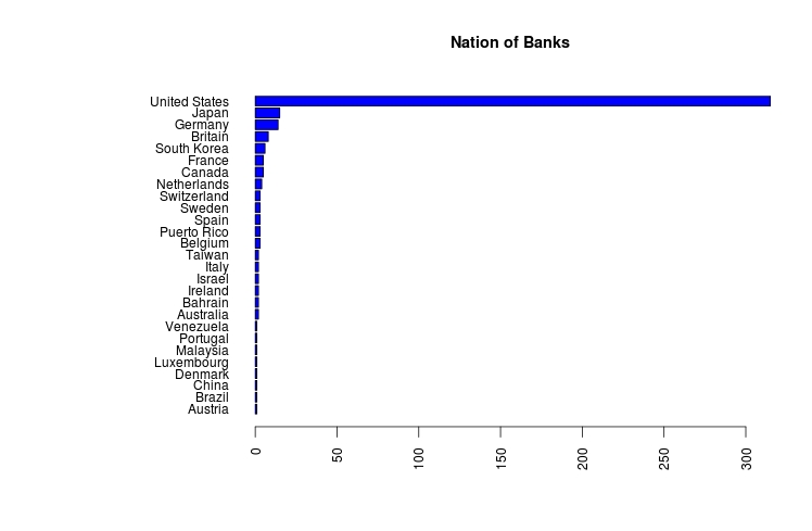
Like so many data sets there are some data clean up challenges. The first is the use of excel, which is not a problem, but the authors decided to add considerable headers, and unusual formats to the summary tables. Here is my attempt to get one of the first data files cleaned up and working. One big problem is changing $1,000.00 into 1000.00, I have some code below, but would appreciate any help in making my code better. Below are the summary graphs of the data:


The basic graphs are pretty self explanatory, for fun I did a regression to see if there is any correlation, the first regression was okay, but i noticed it could use a semi-log transformation. After taking the log of the average daily balance, i got a much better looking regression as well as r^2.


Below is my R code:


#Fed Data
library(stringr)
fed.01<-read.csv(file.choose(), header=T)
summary(fed.01)
 
#Cleaning up the Data- removed the $ sign and the ',' in 1,000
average<-str_sub(fed.01$Average.Daily.Balance..in.Millions.of.U.S..Dollars.,
                 start=2, end=-1)
average<-as.numeric(gsub(",", '', average))
fed.02<-cbind(average, fed.01)
 
#Exploritory Graphs
hist(fed.02$Days.in.Debt, main='Histogram of Days in Debt',
     col='red', xlab='no. Days in Debt')
years.debt<-fed.02$Days.in.Debt/365
hist(years.debt, main='Histogram of Years in Debt', col='red',
     xlab='no. Years in Debt', breaks=15)
 
#Bar graphs the the data
#The country of origin
par(las=2, mar=c(5,12,4,2), mfrow=c(1,1))
country<-sort(table(fed.01$Country))
barplot(country, main='Nation of Banks', col='blue', horiz=TRUE)
 
#Type of Bank or Industry
par(las=2, mar=c(5,17,4,2), mfrow=c(1,1))
industry<-sort(table(fed.01$Industry))
barplot(industry, main='Type of Industry',
        col='blue', horiz=TRUE)
 
#Organizations with average balances greater than $5 billion
five.bill<-subset(fed.02, average>5000)
par(las=2, mar=c(5,19,4,2), mfrow=c(1,1))
barplot(sort(five.bill$average),names.arg=five.bill$Company,
        main='Companies With Average Daily Balance Greater
        than $5 Billion', col='blue', hor=TRUE)
 
 
#Organizations with debt more then 730 days (2 years)
year.comp<-subset(fed.02, Days.in.Debt>730)
par(las=1, mar=c(5,20,4,2))
barplot(sort(year.comp$Days.in.Debt),
        names.arg=year.comp$Company,
        main='Companies With Days of Debt Greater
        than 730 Days (2 Years)
        days', col='red', hor=TRUE, xpd=FALSE, 
        xlim=c(720, 830))
par(las=0, mar=c(5,4,4,2))
 
#Regression of Days in Debt to Ave. Daily Balance
 
#ploted the data, the r2 is poor, and the slop is positive, 
#nothing to get too excited about, took the log
plot(fed.02$Days.in.Debt, fed.02$average, xlab='Days in Debt',
     ylab='Ave. Daily Balance', main='Scatter Plot:
     Daily Balance and Days in Debt')
lm.01<-lm(fed.02$average~fed.02$Days.in.Debt)
abline(lm.01)
summary(lm.01)
 
#log of fed$average to reduce the outliers
log.aver<-log(fed.02$average)
plot(fed.02$Days.in.Debt, log.aver, xlab='Days in Debt',
     ylab='Log of Ave. Daily Balance', main='Scatter Plot:
     Log Daily Balance and Days in Debt')
lm.02<-lm(log.aver~fed.02$Days.in.Debt)
abline(lm.02)
summary(lm.02)
Created by Pretty R at inside-R.org

Friday, December 23, 2011

A Christmas Miracle

Data files on 407 banks, between the dates of 2007 to 2009, on the daily borrowing with the US Federal Reserve bank. The data sets are available from Bloomberg at this address data 

This is an unprecedented look into the day-to-day transactions of banks with the Feds during one of the worse and unusual times in US financial history. A time of weekend deals, large banks being summoned to sign contracts, and all around chaos. For the economist, technocrat, and R enthusiasts this is the opportunity of a life time to examine and analyze financial data normally held in the strictest of confidentiality. A good comparison would be taking all of the auto companies and getting their daily production, sales, and cost data for two years and sending it out to the world. Never has happened.

Thank you Bloomberg for making it available and Drudgereport.com for the link to it.

Wednesday, August 3, 2011

Tomboy Notes: Personal R Help File

When learning R it is helpful to have your own personal help file. One you create for yourself, with the notes, links, and language you understand (sometimes the help files are not very helpful). Let me introduce you to Tomboy Notes.

Tomboy Notes is a light weight and simple note taking program that will work on Windows, Mac and Linux ( to download use: http://projects.gnome.org/tomboy/download.html). There are two features I would like to highlight, the notebook and the link system.

The notebook allows the user to combine and organize the separate little notes into one area or file, while still retaining their individuality. Opening Tomboy Notes for the first time there is a blank post-it-note looking screen with a a couple of buttons on top. Yep it is that simple. Start writing text and the note will be saved automatically and a list of notes will begin to form. As the number of little notes grows there will arise the need to organize them.

This is done in the main page under file- Notebooks- New Notebook. Once a notebook is made a simple click of the file will show the notes in that particular notebook. Also if some of the notes are needed in several notebooks, that is okay, they can be used in as many notebooks as desired. This is a great way of organizing and keeping track of various notes within the program.

The next feature is the link. Linking button, with a little arrow pointing down, takes a word or phrase, then creates a new note. This note has the title of the word/phrase just highlighted, with the additional comments added by the user. The nice thing about Tomboy Notes is when a link is made, any time that word is used (past or future) that word now links up to that note.

For example when looking up the plot function I went to my R-Code notebook (large window), opened the plot note (medium, top-right), then I had a question about xlim, I click on the blue link and a description of the xlim function is given (small, bottom-right). All of this was done with 3 clicks of the mouse.


Anytime I insert any bit of code from R-Blogger I past it here to see what code I do not have a note about (not blue). This way I can focus on code I do not know. If I do have the code but there is a new twist, I can edit the link to add the additional information and all the links are updated. Tomboy Notes is a convenient and simple way of managing and organizing the vast amount of code available in R, in a personal way. Every time I get a new set of code I paste it into R-Studio to play with it, and Tomyboy Notes,. With each new set of code my own help file expands and so to my understanding of R. And in case I forget, I can go back and find it.